Group Hangouts Made Easy


MSH Labs is a social media platform that streamlines the process of meeting up with friends.
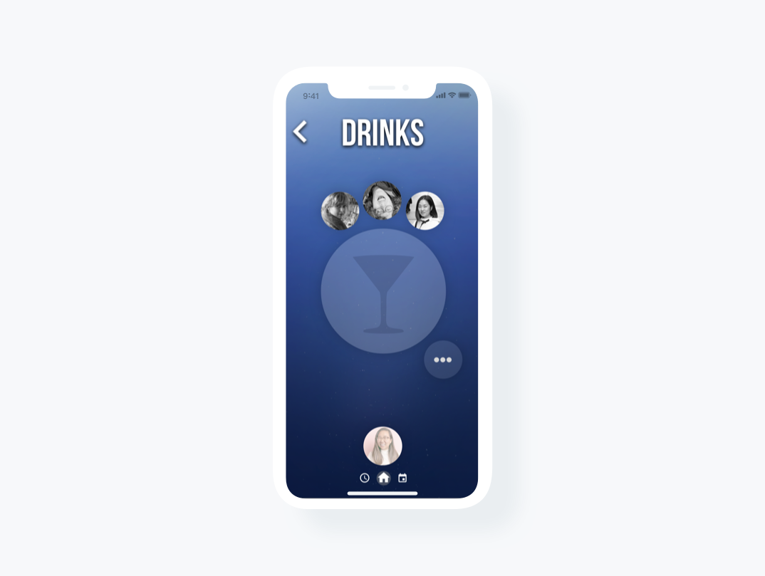
Through an iPhone app, MSH aims to eliminate the need for inconvenient group messages and create a fun platform to plan events. With strategic interface design, the app enables people to quickly and easily absorb information in order to understand the events occurring around them.
MSH challenged my team to discover pain points in the current app and gauge the feasibility of certain new features.
Through Berkeley Innovation, I worked on redesigning MSH Lab's user flow and gesture language. I worked with Sebastian Ospina, Isabel Llacer, and Josephine Zschiesche on this project, and we were mentored by Emily Sun.

Step 1: Research
Before spending time on features like collaborative editing and interface customization, our research pointed us to an area that could benefit greatly from focus on its design--interface evolution. Test users found navigation difficult, “frustrating,” or had “no clue” how to complete certain tasks.
Our Process:
We interviewed high school students, college students, and urbanites (24+ millennials). We asked preliminary questions regarding information they wanted when meeting up with friends/current methods for contacting groups they wanted to meet up with. Then, we had them complete certain tasks on the app. Finally, we asked them questions regarding that experience with the app and what current ways they interact with friends through pictures.
Pain Points
Navigation
When asked to complete certain actions within the app, users encountered difficulty understanding where features were placed, as well as understanding the purpose behind certain features. Many users expressed confusion at the general user flow and wanted more guidance and instruction to use the app.
Excessive Features
We noticed through our research that users failed to use or explore a bulk of the available features on the app, such as the gamified leaderboard, event history, and weekly ranking. Additionally, the animated interface and interactions felt busy and distracting.
Gesture Language Against Intuition
Users did not understand the different actions of dragging and tapping elements on the app, unless otherwise instructed.
Step 2: Insights
Event Planning
People tended to use texting and Facebook messenger in order to contact friends and make plans. Many of our interviewees expressed that facebook events are useful for finding out what’s occurring in the area and well as finding out who’s attending. When attending an event, people also want important details such as knowing confirmed attendees and transportation options.
Redundancy
The current version of the app has features that are accessible from various screens in a manner that wasn’t beneficial to the user--rather, testers were confused when differing icons led to the same screens/features that they expected to be something else.
Step 3: Ideation
After our rounds of research, we began our ideation with the goal of fixing navigation, gesture, and consistency issues. At this stage, we focused on breadth rather than depth, identifying solutions as simple as scrolling bars to more unconventional interactions such as spring buttons.
We brainstormed a wide array of solutions with sticky notes.

With sketches, we focused on certain possible features like spring buttons and footers.

We further explored specific functions and gestures such as scrolling bars, spring buttons, and quick nav search through basic user flow sketches.

In low-fi mockups, we focused on core functions of the app and streamlined its navigation features in order to promote a clear information hierarchy, quickly understandable screens, and a consistent gesture language.
With Sketch, we refined a navigation bar that was screen space-efficient and aided users in navigating through the entire app. In Figma, we mapped out user flow to get a better understanding of the interface’s clarity of implementing the solutions we identified, preparing for a higher fidelity prototype and further user testing.
Creating user flows and higher fidelity versions of the app allowed us to understand the feasibility of different options, demonstrating the importance of budgeting space on the screen while also highlighting the benefits or disadvantages of the features. This exploration enabled our client to clearly outline the tradeoffs of various layouts of the app.
Step 4: User Flow

Step 5: Prototype and User Testing
We created a working prototype through Invision with the newly defined user flow. Upon testing our prototype, users expressed an easier understanding of navigation and functions.
Reflections:
An important lesson we learned in the project was vouching for important design decisions while still satisfying the client. When MSH Labs approached us with this project, it was difficult to reconcile all the different ideas they had in mind to engage the users, and ultimately we chose to improve the necessary features and the navigation. Moving forward, we learned the importance of helping the client to clarify their project goals into actionable items.