
Through Berkeley Innovation, I worked on redesigning Remeeting's interface and onboarding process. I worked with Marisa Ahmed, Grant Kalasky, and Shuyin Xu on this project, and we were mentored by Karen Chou.
The Design Problem
When we took on this project, Remeeting did not have a built out interface. While they did have a minimum viable product, there was room for improvement for the overall user experience. We hoped to improve existing screens as well as add new interactions/features that would help users easily navigate and use the product.
Step 1: Research
User Interviews
Each member of the team conducted individual user interviews in order to better understand the needs and frustrations involved with a tool like Remeeting. With the understanding that Remeeting sought to be used in company meetings, I spoke to business professionals to understand how they participate in meetings along with the general behavior and perceptions around transcription services.
Competitive Analysis
We compared similar, competing products in order to better understand existing patterns and interactions associated with speech and transcription interfaces.
Personal Usability Test
In addition to user interviews, each member conducted a usability test with the current MVP.
Step 2: Insights
From the user interviews and usability testing, we saw there were two main use cases for the product: users looking for verbatim transcriptions and those looking for summaries, both of which were in professional settings. Using these insights, we developed these personas to help guide the rest of our design decisions:


Users wanted:
Meeting Summaries / Action Items: Want to access important meeting points easily
Transcript Accuracy: Need transcripts to be as accurate as possible
Security: Want to be sure that confidential meeting information will not be leaked
We needed to improve:
The onboarding process: Need more guidance for first time users
Calling process: Simplify process to make a call
Transcript organization: Create a better storing and organization system for the transcripts
Content: Need meaningful action names and icons
Our team decided that a redesign of the existing platform would allow Remeeting to address the usability issues with the MVP, create a more concrete product vision, and more clearly define their target market.


Step 3: Mid-fi Wireframes
After creating some initial screens, the team began to refine the product vision and deciding to simplify the overall product. Rather than create an entire scheduling feature within the product and complicate the problem we were trying to solve, we decided to focus solely on the features currently built in the MVP.
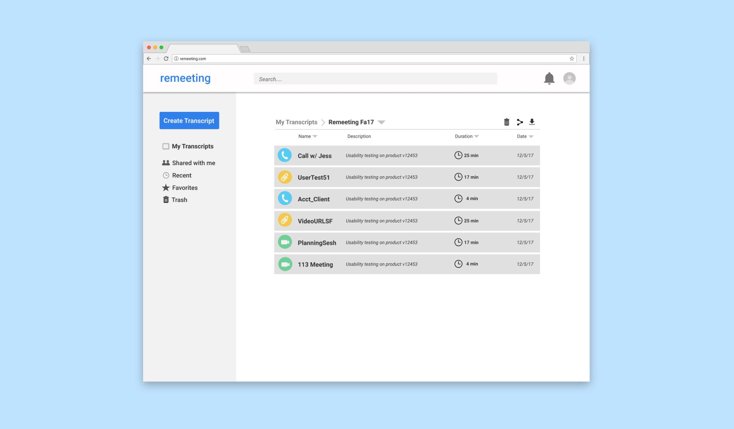
We use the analogy of a file cabinet for the platform. After significant discussion, the team decided that Remeeting would serve as a place to save, view, and edit transcripts for important conversations, meetings, and interviews. With this refined product vision, we took our lo-fi wireframes and translated them to mid-fidelity.


Step 4: Hi-fi Wireframes
Based on the feedback we received from user testing, we explored the ways we could make the transcripts feel more personal and understandable. We came up with different ideas on how to display conversation, and ultimately decided that color coding the different members of the group conversation would allow for intuitive readability.

